6 min read • May 30, 2026
How I Organize Color Tokens in shadcn/ui
When creating a color theme, the most important thing is not the individual colors themselves, but how those colors work together.
A primary color might look good on its own, but if it clashes with backgrounds, muted surfaces, borders, or text colors, it quickly becomes unusable.
Because of that, I always start by visualizing the entire palette instead of choosing colors one by one.
At first, I used Figma to build style guides. But since shadcn/ui already relies heavily on color tokens, I switched to creating a dedicated page directly inside the app. I ended up liking this workflow much more because it lets me see the colors in a real UI environment instead of a static design file.
Visualize the whole system
To make the palette easier to evaluate, I built small card groups that display both the color and its token name.
I usually create:
- one group for the light theme,
- and one for the dark theme.
This makes it much easier to judge:
- whether colors work well together,
- whether text remains readable,
- and whether the overall theme feels consistent.
Since the page is live, I can instantly tweak colors and immediately see how they behave in actual components instead of guessing.
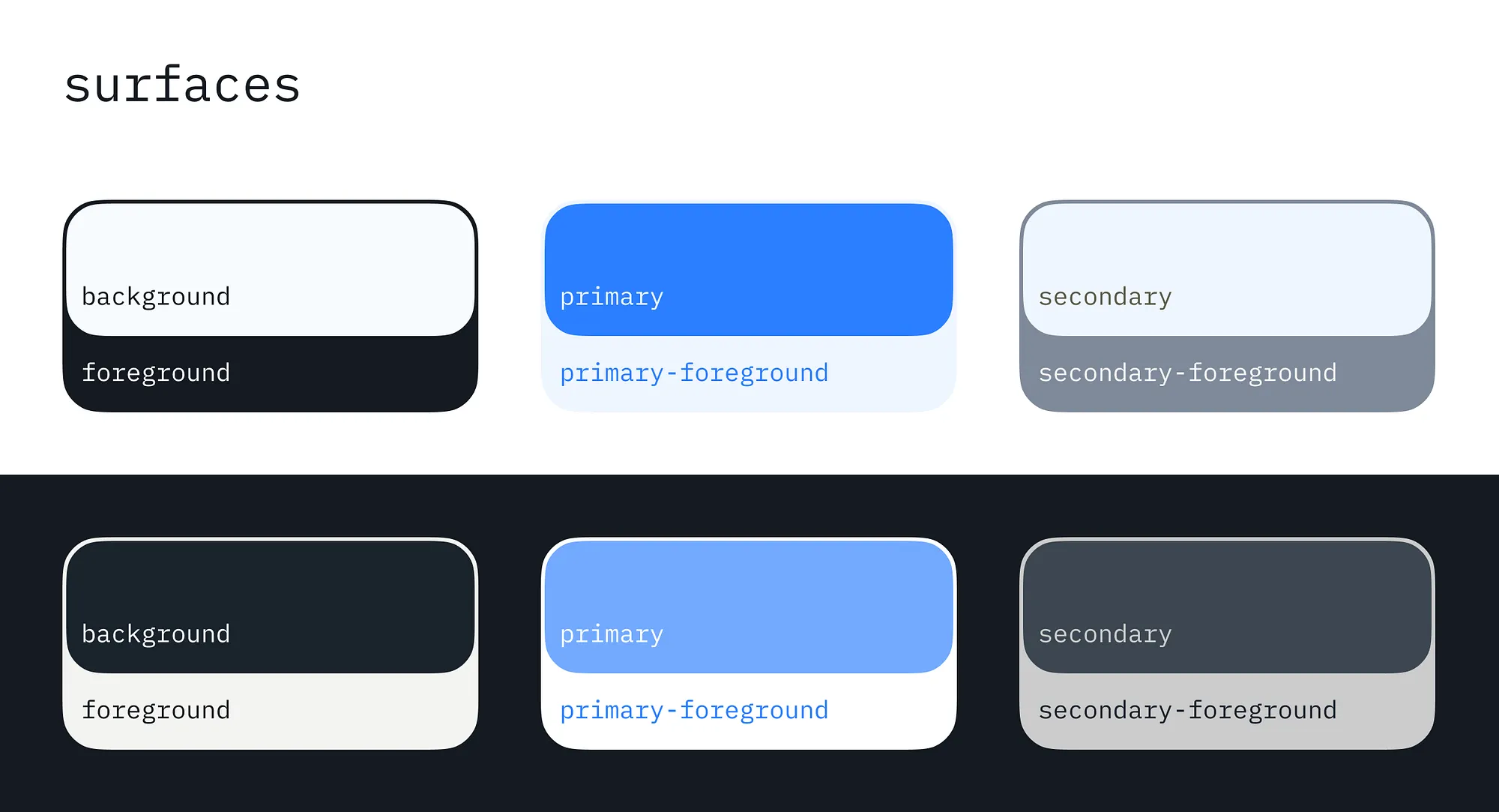
Another benefit of this approach is that it reveals the relationship between different color groups. You can quickly tell whether the palette shares the same visual mood across surfaces, borders, accents, and backgrounds.
The same applies to dark mode. It becomes much easier to see whether the same color logic still works once the interface switches themes.
Make colors work together in real components
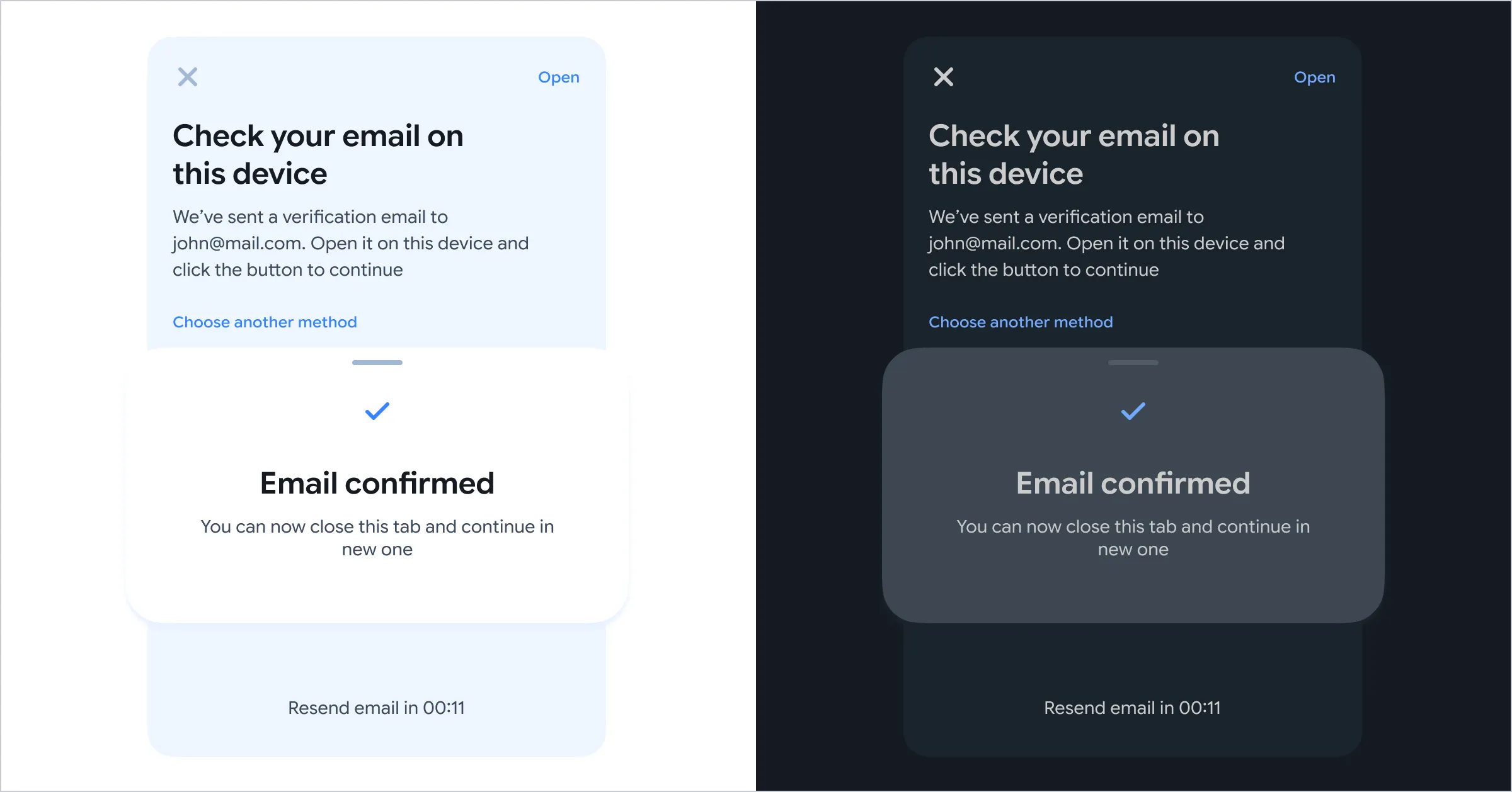
Another important step is testing the palette on actual components — not generic demo UI.
By “real components,” I mean the components your application truly uses every day.
Most theme generators showcase dashboards filled with charts, gradients, and colorful widgets. But many applications are not dashboards. If your product mostly consists of forms, tables, dialogs, cards, and text-heavy layouts, those flashy previews become misleading.
You may choose a palette that looks great in a theme picker but falls apart in your real interface, where most surfaces are simply variations of background, foreground, border, and muted colors.
Because of that, I always preview themes directly on production-like components. This helps me evaluate:
- readability,
- contrast,
- spacing perception,
- visual hierarchy,
- and whether the interface still feels cohesive when colors are used more subtly.
A palette should not only look good in isolation — it should support the actual experience of the app.
Make hover states intentional
By default, many shadcn/ui components create hover states by applying opacity: 0.8 to the background color.
Technically, this is a simple and effective solution. But technically effective does not always mean visually effective.
Instead of relying entirely on opacity changes, I prefer defining dedicated shades for interaction states:
- a slightly darker shade for hover,
- and a middle shade for active or pressed states.
This creates interactions that feel more natural and tactile.
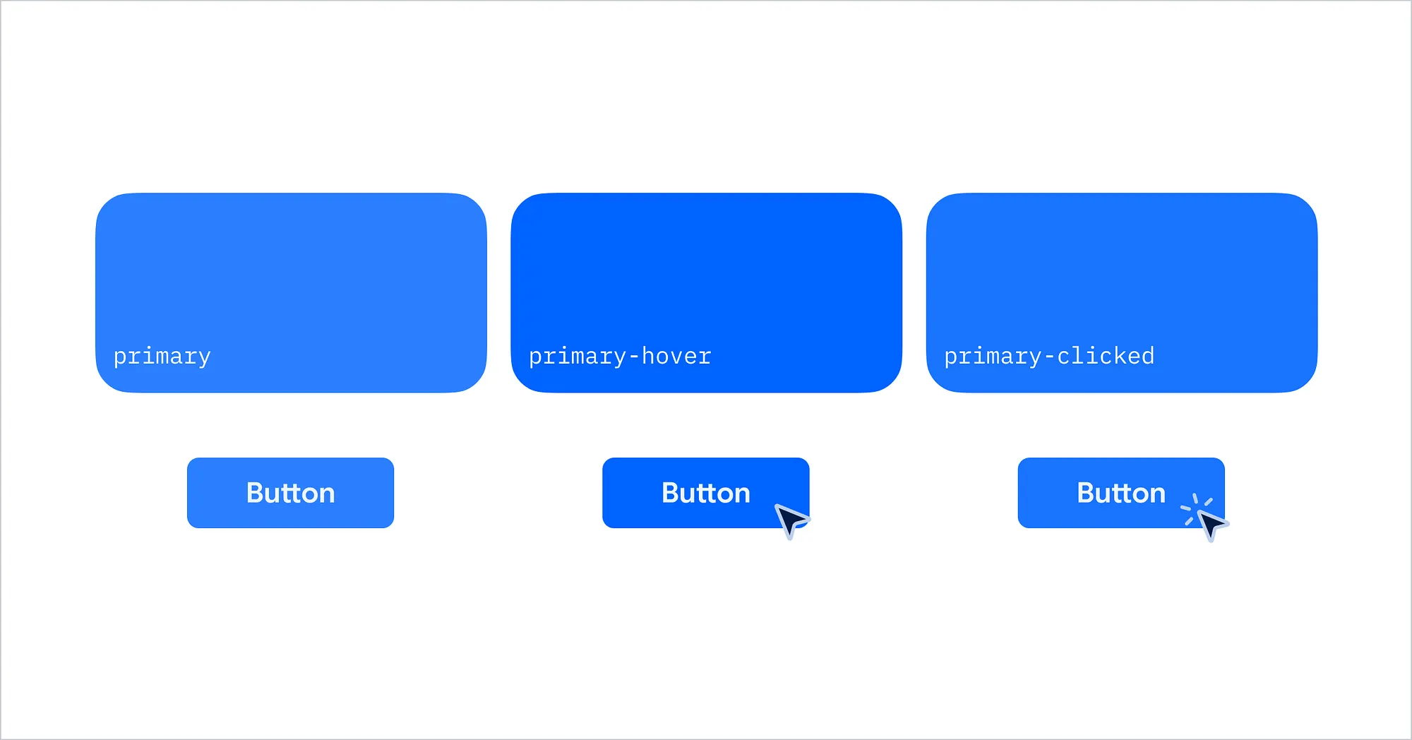
By the way, this mirrors how physical buttons behave in real life. As light changes across a surface, pressed states usually appear somewhere between the default and shadowed state. Recreating that subtle depth makes interfaces feel more responsive and intentional.
Even small adjustments to hover and active states can dramatically improve the perceived quality of an interface.
Curated interaction states also help your application feel less like a default shadcn template and more like a polished product with its own visual identity.
Learn the token system properly
If you are still tempted to hardcode colors directly inside components, I strongly recommend spending some time understanding CSS variables and semantic color tokens first.
shadcn/ui relies heavily on this system, and while it may feel confusing initially, the payoff is worth it. The fundamentals only take a few hours to learn, and once your theme architecture is set up correctly, the entire application becomes much easier to maintain.
For me, building a good theme usually takes 2–3 days of iteration, testing, and refinement. But that investment pays off quickly because future changes become significantly easier.
One small workflow improvement that helped me a lot is adding comments with the original Tailwind color names above my token values.
For example:
/* gray-200 */
--border:oklch(92% 0.004 286);
Later, when adjusting the palette, I immediately know the visual reference point I started from.
Without those comments, I often found myself trying to reverse-engineer OKLCH values just to remember whether a color originally came from gray-200, zinc-100, or something else entirely.
It is a small detail, but it makes theme iteration much faster and less frustrating.
Keep dark mode aligned with the same visual mood
When designing a dark theme, the goal is not simply to invert colors, but to preserve the same visual mood as the light theme.
In many cases, a simple inversion of grayscale values works surprisingly well. For example:
gray-900in light mode can becomegray-100in dark modegray-800can becomegray-200, and so on
This approach works especially well for neutral colors because they are already structured around lightness levels.
However, this strategy does not translate as well to more color-heavy elements.
For accents and brand colors, I often avoid strict inversion and instead choose slightly brighter or more saturated values for dark mode.
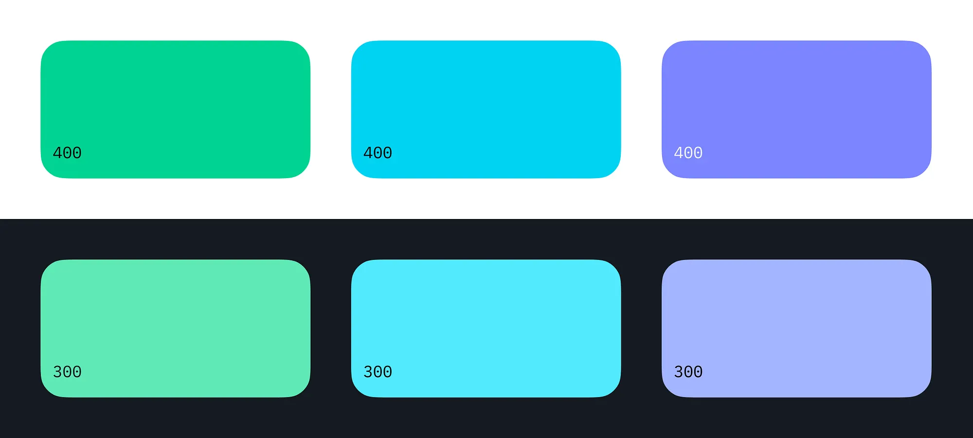
On dark surfaces, these colors tend to feel more natural, readable, and visually balanced.
The key idea is consistency in mood, not symmetry in values. A good dark theme should feel like the same product in a different lighting condition, not a completely different design system.
Summary
A good color system in shadcn/ui is not about picking nice colors — it’s about building a structure where colors behave consistently across light mode, dark mode, and real components.
Instead of thinking in individual colors, think in relationships, tokens, and states. Design your palette visually, test it in real UI, and make sure it supports the actual product you’re building — not just idealized previews.
Small decisions like semantic tokens, intentional hover states, and consistent dark mode mapping add up to a system that feels cohesive and scalable over time.