Color systems get complicated quickly — more shades, more tokens, more exceptions. Yet most interfaces aren't held back by a lack of colors, but rather by the colors they're built on.
I’m building a color system around a simple idea: fewer colors, more intention.
Four light and dark surfaces.
A limited palette of neutral grays defines surface levels in both light and dark themes.
Pair them with shadows to establish depth without introducing unnecessary colors or complexity.
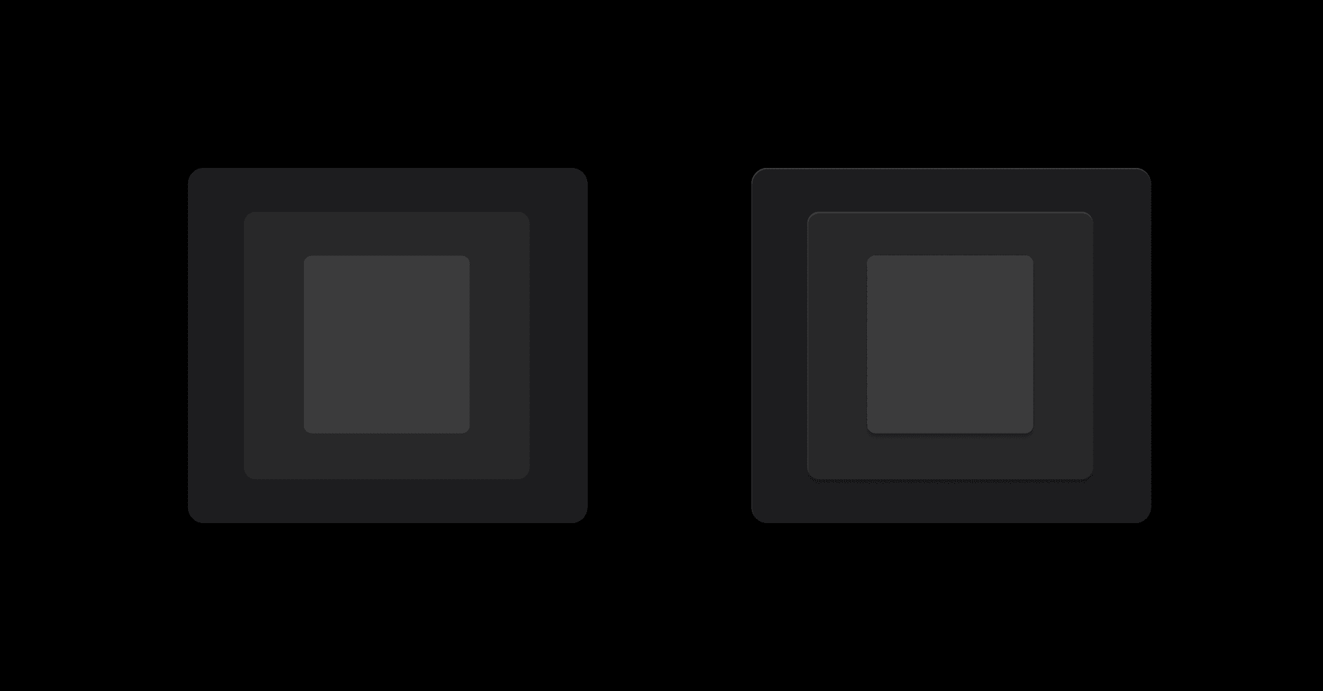

Surface examples
A limited palette of neutral grays defines surface levels in both light and dark themes.
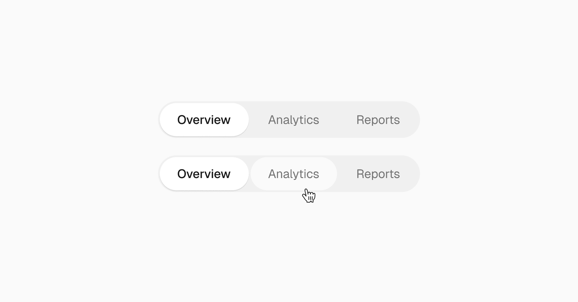
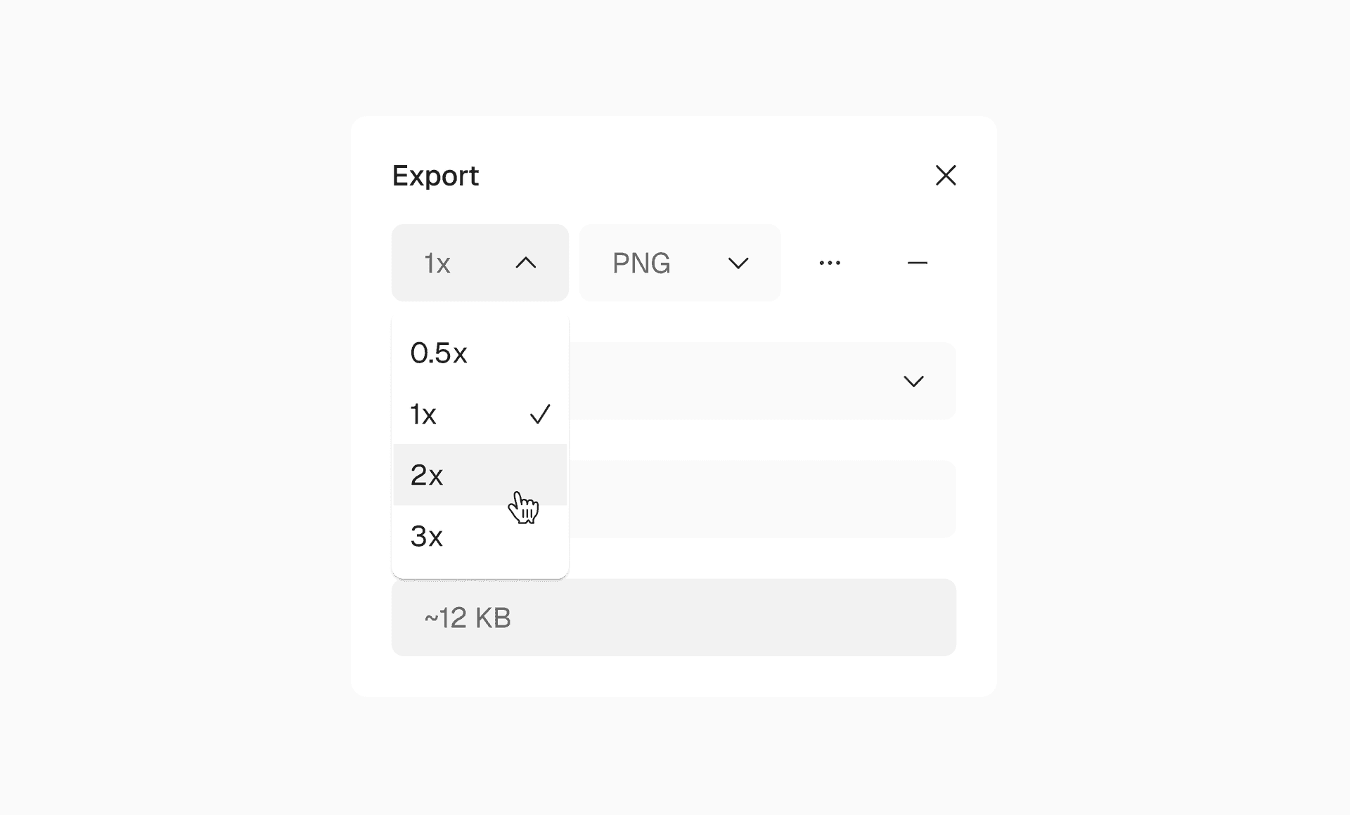
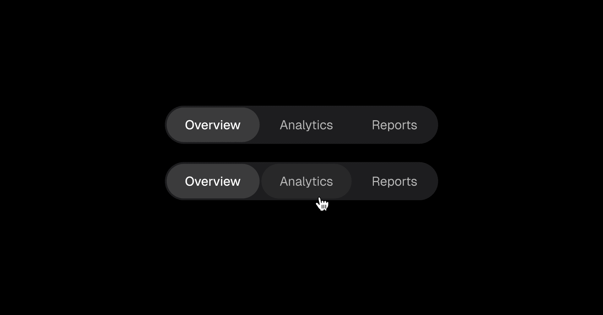
Two levels of text
Two neutral text colors cover most cases: a primary color for content that needs attention, and a secondary color for supporting information.
Fewer choices make hierarchy more consistent across the interface.
Good Design Is as Little Design as Possible
Less, but better – because it concentrates on the essential aspects, and the products are not burdened with non-essentials. Back to purity, back to simplicity.
Dieter Rams Ten Principles of “Good Design”
Good Design Is as Little Design as Possible
Less, but better – because it concentrates on the essential aspects, and the products are not burdened with non-essentials. Back to purity, back to simplicity.
Dieter Rams Ten Principles of “Good Design”
Borders and dividers
Borders use a single neutral color that works across components. The same color can separate sections, define input boundaries, and create dividers in Markdown content.
One token, multiple uses. No need to introduce a new color for every separator.
The Foundation for your Design System
A thoughtful set of color, text, border, elevation, and spacing tokens, ready to use in Figma and code.
The Foundation for your Design System
A thoughtful set of color, text, border, elevation, and spacing tokens, ready to use in Figma and code.
Semantic tokens
The system comes with semantic tokens that map colors to their purpose, so components don't need to reference raw colors directly.
Surface, text, and border tokens adapt to light and dark themes automatically, keeping everything consistent across the interface.
The tokens are also designed to work with Tailwind's theming system, making it easy to bring the same color logic into your code.
Built for Figma
The system will come with a Figma file containing the full palette, color variables, and design tokens, ready to use in your own projects.
Everything is organized to make it easy to explore, copy, and adapt to your existing design system. No need to recreate the tokens from scratch.
Get the full system for free
The full system, including text, elevation, border, and spacing tokens.
It'll be available at the end of November.